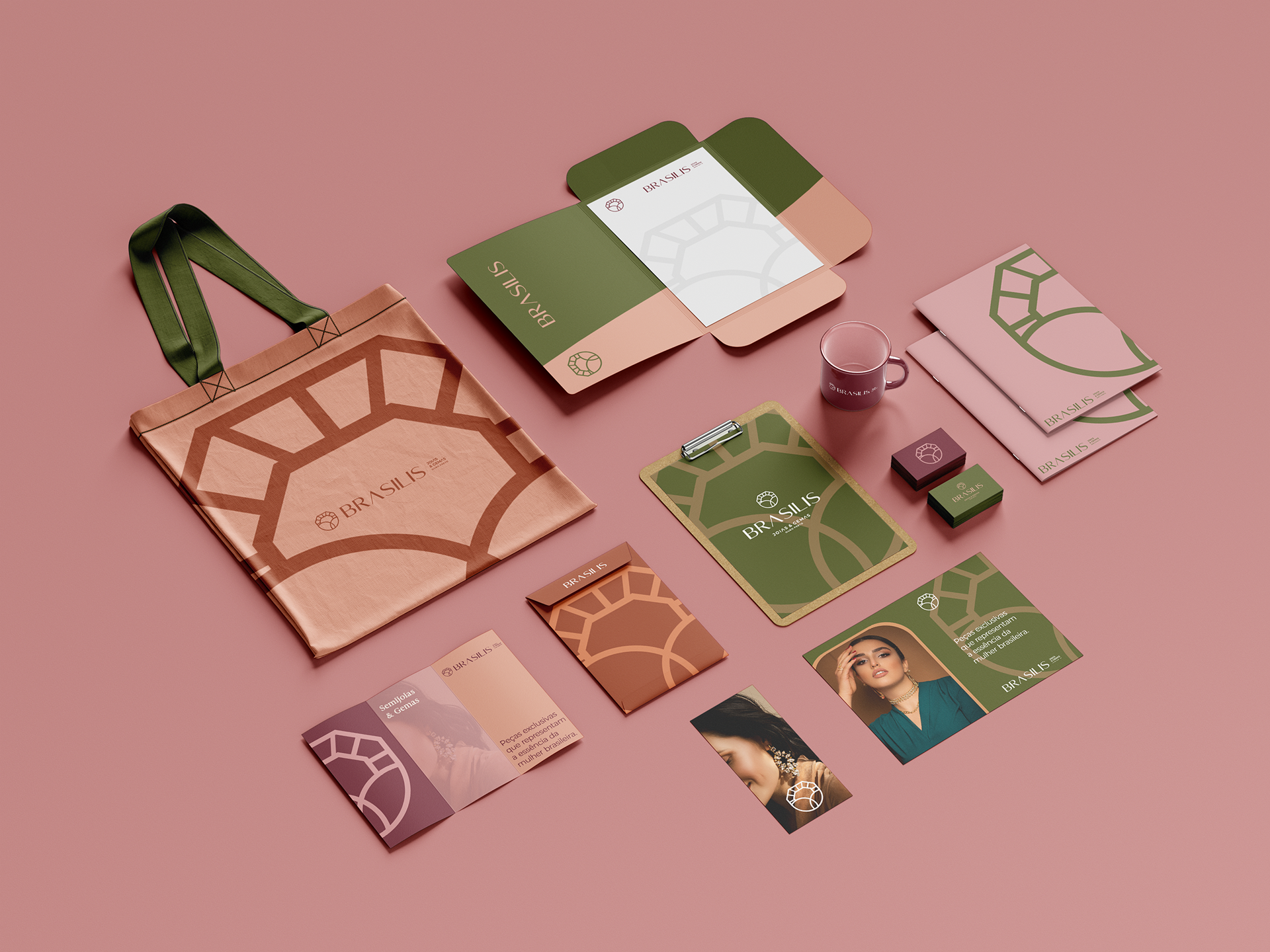
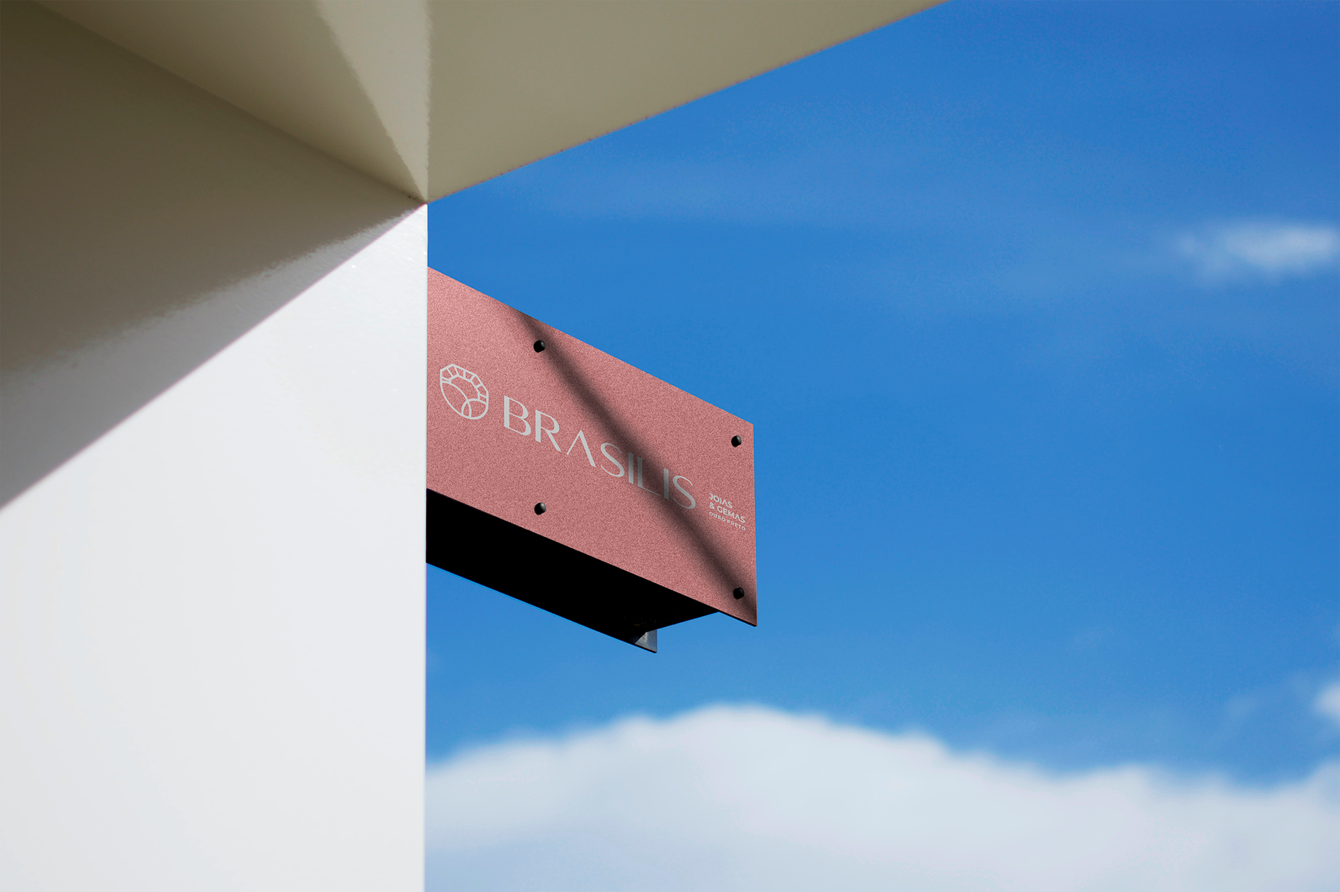
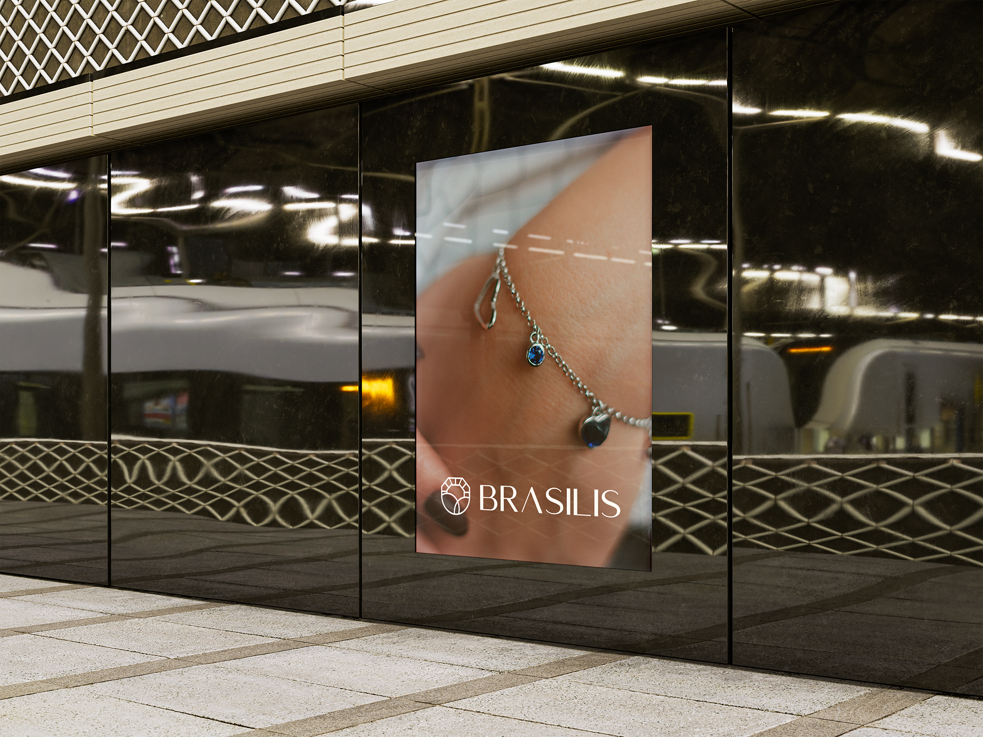
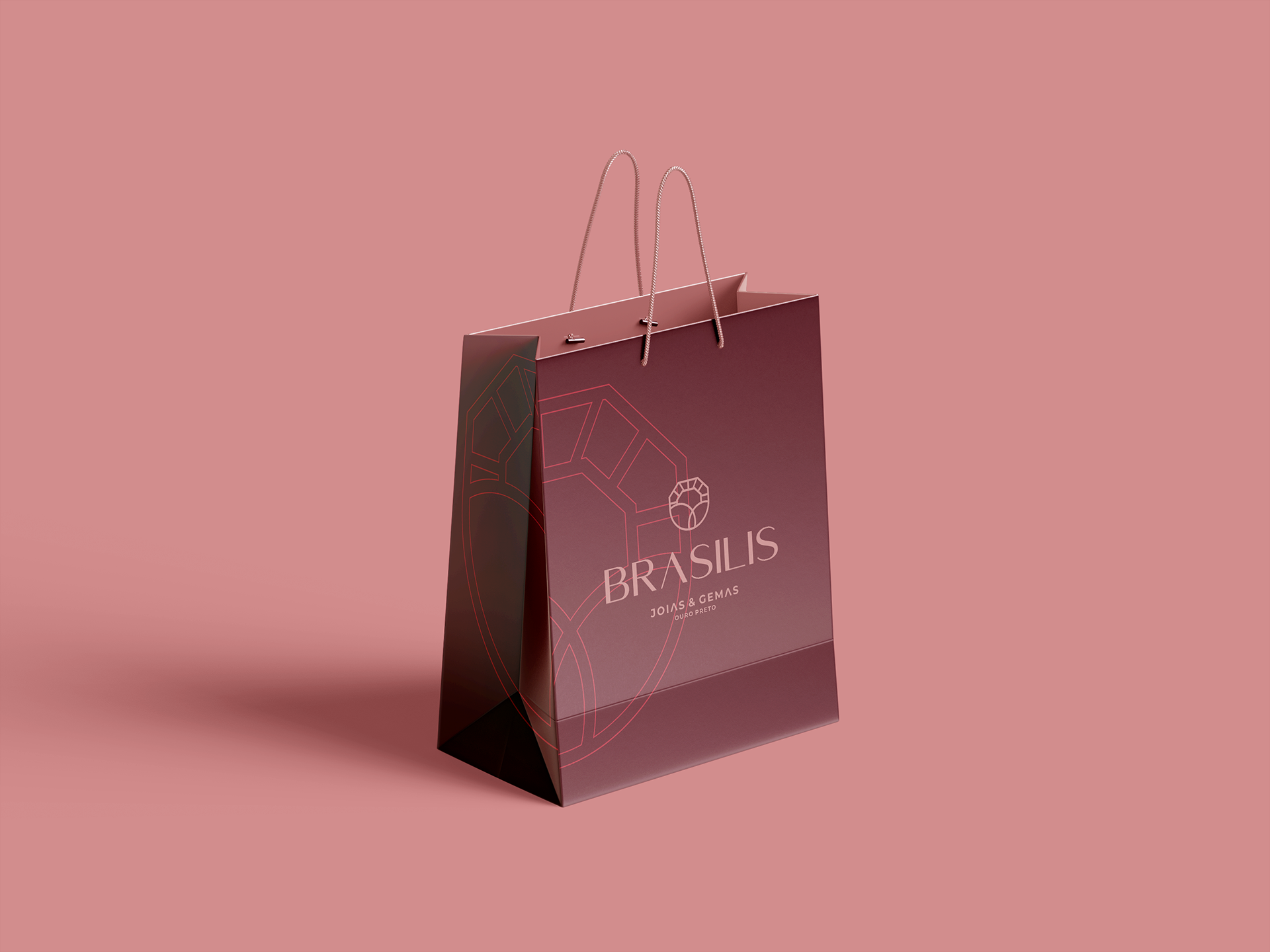
Brasilis - Joias & Gemas Ouro Preto / MG
Este é um projeto de Redesign de marca de uma empresa que atua no ramo de joias em Ouro Preto a mais de 15 anos, que percebeu que era o momento de mudar, de apresentar uma marca mais moderna e diferente das outras empresas da região, que compartilham elementos parecidos.
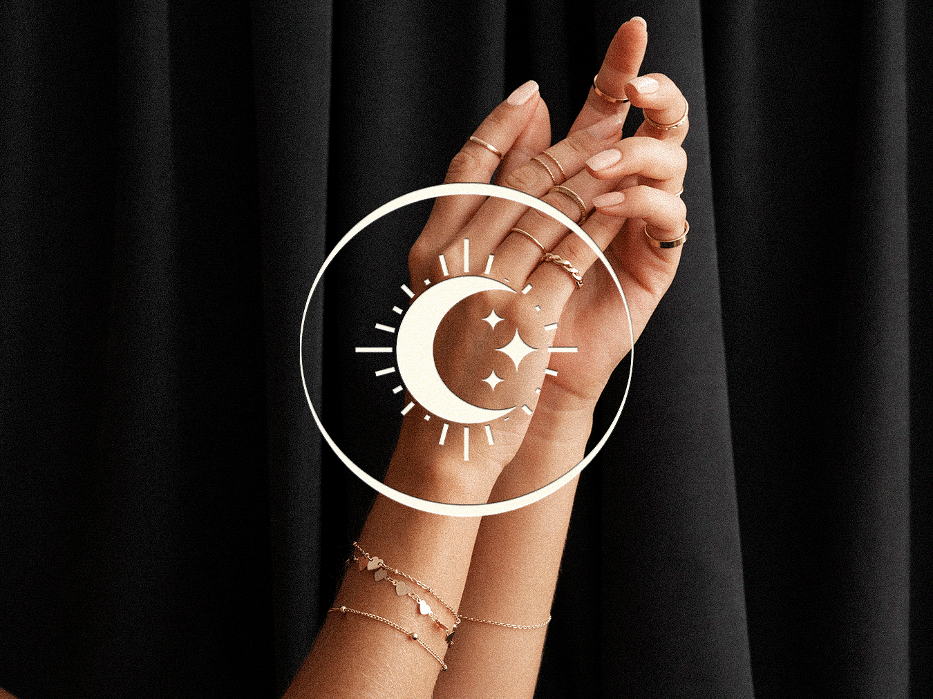
O objetivo foi criar uma marca que fosse moderna, feminina e minimalista, que ainda remetesse de alguma forma ao design antigo.
Símbolo:
A solução encontrada foi uma junção de formas que representam 3 coisas:
Joia - Pôr do sol por trás das montanhas em Ouro Preto (imagem frequentemente vista pelas montanhas de ouro preto) - Ave (que estava presente na marca antiga)
Paleta de Cores:
A paleta é bem feminina e brasileira.
Brasilis - joias & Gemas
This is a brand redesign project for a company that has been in the business of jewelry in Ouro Preto for 15 years. The company realized that it was time for a change, to present a more modern brand, different from the other companies in the region, which share similar elements.
The goal was to create a brand that would be modern, feminine, and minimalist, but that would still somehow refer to the old design.
The goal was to create a brand that would be modern, feminine, and minimalist, but that would still somehow refer to the old design.
Logo
The solution found was a junction of shapes that represent 3 things:
Jewel - Sunset behind the mountains in Ouro Preto (an image often seen from the mountains of Ouro Preto)
Bird (which was present in the old mark)
Jewel - Sunset behind the mountains in Ouro Preto (an image often seen from the mountains of Ouro Preto)
Bird (which was present in the old mark)
Color Palette:
The palette is very feminine and Brazilian.